Happy Tap
In this project wanted to create a product design that would be flexible enough to accommodate multiple flavors or versions. The target audience was gourmet customers, such as those at Whole Foods, Central Market, and Trader Joe's. I chose to develop a gourmet-based water brand with options for still and sparkling water.

01
Mood board
I started by exploring how other companies designed their new canned water products and how they used different SKUs to showcase various versions of their products. Additionally, I examined some regular canned products that I believe are designed successfully

_Page_1_Image_0001.jpg)
02
Sketches of logo
After creating the mood board and transitioning to sketching some logos, I began with the name 'Happy Tap' and built around that concept. I started by incorporating a smile and happy face, and in some designs, I focused on water elements.
03
Sketches of full can
After finalizing a name and establishing more direction, I created two versions—one with a water-based design featuring a wave with a happy face and another emphasizing the smile element.
_Page_3_Image_0001.jpg)
_Page_2_Image_0001.jpg)

04
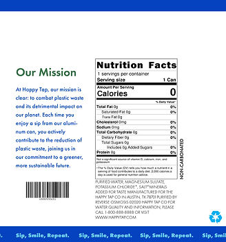
First draft of full can
In this draft of the full can designs, I decided to go with a smile pattern to wrap the entire can. The design includes everything necessary, such as the barcode, nutrition facts, ingredient list, and a brief mission statement about the company. With this design, I envisioned that the smiles wrapping the can could be used for different SKUs.
05
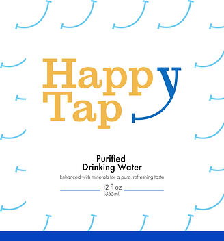
Refined design
In the redesign, I removed the pattern of the smiles because it was feeling a little overwhelming and harder to read. However, I kept the idea of changing the smile in the logo to be able to adapt it for different SKUs, as shown in my examples of having a still water and sparkling SKU.