Top Dogs
In this project, the goal was to create a twenty-two-page spread with text and high-quality pictures. I chose to feature the top 10 most expensive dog breeds and provided information about each breed.


01
Mood board
In the mood board, I put together various spread designs featuring dogs. I focused on how they designed the covers for these spreads, observing the integration of photography with typography, and examining the usage of titles and subtitles.
02
Sketches of layout & covers
Next, I moved on to doing some sketches to plan out the layout and decide on the cover design. I also experimented with creating catchy titles like "Top Dogs" and "Pricey Poochies" to grab the viewer's attention.


03

First draft of covers
Next in these first drafts of the cover, I was experimenting with finding the right typeface and determining how to layout the text with the picture of the dog. This involved placing some of the text under the picture, as seen in other spreads.
04
First round design
In this first design of the spreads, I opted for using a full page of photography for each subject. I split the type into two columns and incorporated visual elements to highlight facts and information about the breed on each page. Additionally, I included a bone as a counter box to display the page number on the spread.


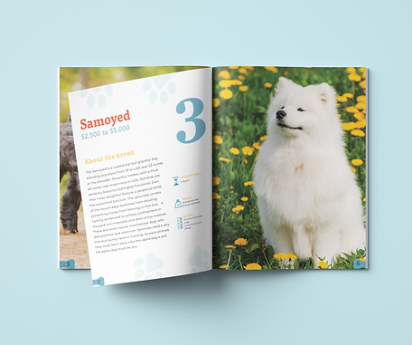
05
Redesign of spread


In the redesign, I decided to consolidate the text into a single column for better flow and readability. Next, I made adjustments to some of the photography to enhance the overall presentation of the spread. I also modified the visual elements to match the spread, ensuring a uniform and cohesive look. Additionally, I changed the style of the bone counter for the page numbers to align with the overall design of the spread.